
Wednesday, November 2, 2016
Gold and the 50-day moving average relation
Something, that I am observing closely for the major long term trend in gold, is the 50-day moving average (50MA) on the monthly chart (MN). So far, 5th month in a row, gold is being pulled to it and is unable to choose direction. Which way will it go from here will shape this market for the years to come. Most people underestimate the simple 50-day moving average, but to me it is probably the most valuable technical indicator, and together with the 200MA they make for an extremely accurate, and yet simple, measure of market direction.


US defense stocks flashing bull trap: LMT, RTN, GD, NOC
In spite of the recent geopolitical tensions in the middle east, and the US elections, A few US defensive stocks caught my attention for potential longs, they're as follow: Lockheed Martin Corporation (ticker: LMT), Raytheon Company (ticker: RTN), General Dynamics Corporation (ticker: GD), Northrop Grumman Corporation (ticker: NOC). When I looked at them at first, they look like the perfect candidates to go long: well-established bull trends, no volatility, 80+% institutional ownership, low beta, good dividends and income, how not to love them? However, there's one thing that is common to all of them: the insiders are selling and this is to me the most important sign that there's something wrong with a stock, they always know something we don't.

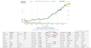


Conclusion: there's no way I'm buying their positions, this all smells like a distribution at the heights of a bull trend, followed by sell off. And with the S&P500 on the brink of a sell off (see my previous post US stocks on the brink of a massive sell off), I see only one way for these stocks and it is down.


Conclusion: there's no way I'm buying their positions, this all smells like a distribution at the heights of a bull trend, followed by sell off. And with the S&P500 on the brink of a sell off (see my previous post US stocks on the brink of a massive sell off), I see only one way for these stocks and it is down.
US stock market S&P500 on the brink of massive crash?
I don't follow the US stock market closely anymore, but I have to admit that it caught my attention recently, as I see the signs of an impending crash coming and I think it's gonna be of massive proportions, similar to 07-08. Here I am going to present to you the monthly and the weekly chart with my projections for the future price levels, followed by a brief explanation. For every market to make such a dramatic turn of events, such as a 30+% crash that I am expecting, there must be 2 things present: first, the market must be matured enough, i.e. it must have climbed substantially for extended periods of time and the majority of the market participants must be complacent and not expecting any major downside moves, and second, and most importantly, there must be a catalyst to spark the sell off, and what bigger catalyst now than the US elections? So here follows my charts that I prepared for you.

Explanation: blue line is 50MA, orange cloud is Ichimoku Kinko Hyo; both provide support in a bull market and show the direction of a trend. As you may notice, the market climbed substantially away of both and even though the direction of the trend remains fairly bullish, I see room for downside correction to test the roughly 1800 support levels. Where it goes from there time will tell, it all depends on market participants' perception, when, and if, we get there.

I am more aggressive in my projection on the weekly chart; I see a test of 1800 support, a weak bounce and then a more massive sell off towards 1300s. I think that the 1800 level is too tempting for way too many participants to put their stops right below it, and I know from experience that Mr. Market loves to hurt those, I think that a slight drop below this support would trigger a more massive sell off. Whether is gonna be the case is early to tell, we'll wait and see. I'll cover a few individual stocks of interest, that I follow closely recently on my next post.
S&P500 monthly chart (MN):

Explanation: blue line is 50MA, orange cloud is Ichimoku Kinko Hyo; both provide support in a bull market and show the direction of a trend. As you may notice, the market climbed substantially away of both and even though the direction of the trend remains fairly bullish, I see room for downside correction to test the roughly 1800 support levels. Where it goes from there time will tell, it all depends on market participants' perception, when, and if, we get there.
S&P500 weekly chart (W1):

I am more aggressive in my projection on the weekly chart; I see a test of 1800 support, a weak bounce and then a more massive sell off towards 1300s. I think that the 1800 level is too tempting for way too many participants to put their stops right below it, and I know from experience that Mr. Market loves to hurt those, I think that a slight drop below this support would trigger a more massive sell off. Whether is gonna be the case is early to tell, we'll wait and see. I'll cover a few individual stocks of interest, that I follow closely recently on my next post.
Wednesday, September 2, 2015
Stages of the gold bubble
A chart I did back in 2013 showing the main stages of the gold bubble in progress.

And here's the updated chart I just did. Gold is descending into "Capitulation" amid the "Blow off" phase.

And in case you've been wondering about the model I'm using...

Sunday, July 26, 2015
Order Has Been Restored
There it is - one of the rarest and least studied patterns, Broadening Top (a.k.a. Megaphone), has finally revealed its secrets to us and I'd say this was a perfect example that shall remain in the textbooks for further studies.
Megaphone (Broadening Top) technical chart pattern update 10: downside price targets of 1108 and 1078 were reached successfully (click on chart below). Notice that right after gold hit 1078, it bounced and rallied 24pts. which means that there is, or at least there was, to be more precisely, a huge buy imbalance at this level.
Calculation of the profit target for this pattern is the same as it is for any Triangle chart pattern - take the lowest (1154) and the highest (1232) trend lines points that price has touched, measure the difference, which in this case is 1232-1154=78 pts., and subtract it from the breakdown point 1154-78=1076, add 2pts. to compensate for spread or error and voila!
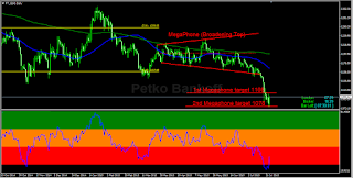
Conclusion: bears did triumph in the end. This MegaPhone (Broadening Top) chart pattern is now fully played itself and irrelevant. No active positions and orders until another pattern reveals itself. 1150's is now resistance, look for new bearish patterns to occur above 1100 to provide good R/R shorting opportunity.
I wish you all a great summer vacation! Stay safe and be cool.
P.B.

Megaphone (Broadening Top) pattern chart update 7 - testing the lower trend line, I anticipate breakdown soon. #Gold pic.twitter.com/lUWkxCJQa5
— Petko Bankoff (@5koFX) July 5, 2015
#Gold Megaphone (Broadening Top) chart pattern update 8 - test and bounce of support trend line but no follow-through pic.twitter.com/AozznBxE2h
— Petko Bankoff (@5koFX) July 12, 2015
Megaphone (Broadening Top) update 9: price has broken down support. Downside targets - 1108, 1078. #Gold #GLD #GC_F pic.twitter.com/znluhk8Dh4
— Petko Bankoff (@5koFX) July 18, 2015
Megaphone (Broadening Top) technical chart pattern update 10: downside price targets of 1108 and 1078 were reached successfully (click on chart below). Notice that right after gold hit 1078, it bounced and rallied 24pts. which means that there is, or at least there was, to be more precisely, a huge buy imbalance at this level.
Calculation of the profit target for this pattern is the same as it is for any Triangle chart pattern - take the lowest (1154) and the highest (1232) trend lines points that price has touched, measure the difference, which in this case is 1232-1154=78 pts., and subtract it from the breakdown point 1154-78=1076, add 2pts. to compensate for spread or error and voila!

Conclusion: bears did triumph in the end. This MegaPhone (Broadening Top) chart pattern is now fully played itself and irrelevant. No active positions and orders until another pattern reveals itself. 1150's is now resistance, look for new bearish patterns to occur above 1100 to provide good R/R shorting opportunity.
I wish you all a great summer vacation! Stay safe and be cool.
P.B.

Tuesday, June 2, 2015
Order Arises Out of Chaos 2
So far, the MegaPhone (Broadening Top) pattern I wrote about in my previous post, is developing according to plan. Price tested the balance area at 1201 and rejected it with volume yesterday. Notice the bearish close of yesterday's D1 candle. Shorts are favored in the 1200 area, should gold test it today. A daily close above 1205 invalidates pattern and brings back the bulls in the driving seat. As long as price remains below 1201 balance line, on a daily close basis, the bears are in control.

Now here's another Megaphone pattern that I wrote about in my twitter earlier last week (click here), this is independent of the aforementioned and is found on the H1 time frame (look chart below).

After gold broke down the descending line acting as support, it ascended to test for resistance the ex-support and respected it. 1201 is a very important level as it was a conjunction of resistance on 2 independent of each other same type of patterns occurring on different time frames.
Conclusion: Bears are in full control now.
That's all for now, stay tuned, I'll keep you posted with updates.
Good luck,
P.B.

Now here's another Megaphone pattern that I wrote about in my twitter earlier last week (click here), this is independent of the aforementioned and is found on the H1 time frame (look chart below).

After gold broke down the descending line acting as support, it ascended to test for resistance the ex-support and respected it. 1201 is a very important level as it was a conjunction of resistance on 2 independent of each other same type of patterns occurring on different time frames.
Conclusion: Bears are in full control now.
That's all for now, stay tuned, I'll keep you posted with updates.
Good luck,
P.B.
Sunday, May 24, 2015
Order Arises Out of Chaos


In spite of the recent volatility and lack of direction in the Gold futures market, I decided that it is time to dedicate a special blog post to it, try to make sense of it all through the perspective of a classical technical analysis chart pattern.
While observing the price action in the last 2 months (see the chart attached), a few things become clear - the market looks quite chaotic and random at first sight - it is volatile, unpredictable, the zones of support/resistance do not act as such, the market makes lower lows and higher highs, both bulls and bears seem unconvinced about direction, volatility is expanding. If I was just entering into trading, I'd say - "Screw this, this is a manipulated bullshit market, there's no way anyone could trade this, it just doesn't make any sense!"
Well, maybe I would have said that 5 years ago and I would have been right about it, but having already collected some experience in this business, it's been long enough to know that after every period of randomness and indecision, a new pattern starts to take shape sooner or later. "Order arises out of chaos" - every theoretical physicist who knows the ways and the patterns of the Universe will tell you this, I can assure you markets are no different! There is randomness to some extent but if you observe it on a long enough time frame or if you just zoom out, you'll see well-structured patterns starting to take shape.
Now to the point. Being a left-handed, my brain uses "visual simultaneous" method to process information, as opposed to "linear sequential" of the right-handed people, i.e. it is a natural pattern-matching machine (read more about it here). Simply said, my brain automatically compares multiple visuals simultaneously without the least effort, I can almost see them in front of my eyes like holograms, that's the power of the active imagination.
Anyway, I was quickly scanning through the charts yesterday while drinking my morning coffee and doing some other stuff on the computer, thinking about who to drag with me to the river beach in this hot Saturday, when it suddenly hit me! Damn, I've seen this pattern before! I even remember its name - "MegaPhone" or "Broadening Top"! It is a very rare but extremely reliable pattern identifiable by series of higher highs and lower lows with expanding volatility.


A Megaphone Top, also known as a Broadening Top, is considered a bearish signal, indicating that the current uptrend may reverse to form a new downtrend.
A Megaphone Top is formed because the stock makes a series of higher highs and lower lows. The Megaphone Top usually consists of three ascending peaks and two descending troughs. The signal that the pattern is complete occurs when prices fall below the lower low.
The creation of the pattern reflects a period of time when bulls and bears are battling to gain control of the stock. The pattern occurs after the bulls have been charging and driving the stock price appreciably higher. During the formation of the Megaphone Top, however, bears are exerting increasing influence on the stock and causing it to set a series of lower lows. The increasing volatility eventually creates a sense of uncertainty, leads to profit-taking, and deters some of the bulls from making any further commitments.
The bears eventually triumph.
Subscribe to:
Posts (Atom)